
Make Your JavaScript Alerts and Confirmation Boxes more Fancier in 10 Minutes
Nowadays web applications are very attractive in terms of graphics and having a great look and feel. In this type of applications, they focus on design their pop-up boxes, confirmation-popups or alert boxes that they must appropriate with their theming and also gives enchanting views to the application.
In this, we are going to check how can we turn the browser’s built-in confirmation box to Bootstrap’s models and design it in your way which gives ravishing look to your application. For this, we are going to use ‘data-confirm-modal’ gem.
Let’s start!
Step 1: First of all create brand new Rails application.
$ rails new CustomConfirmBox
Step 2: Add the following gems in your gemfile:
Step 3: Include the following lines in your application.js.
Step 4: Import bootstrap by adding this line in application.scss.
@import "bootstrap";
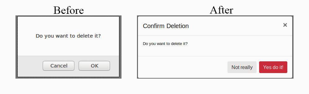
Now, reload your browser and voila!!
You can see the vast difference in your new confirmation or alert boxes.
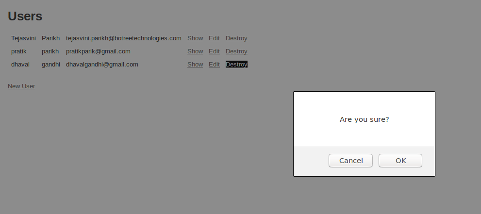
<%= link_to 'Destroy', user, method: :delete, data: { confirm: 'Are you sure?' } %>
Before:
After:
Let’s customize the confirmation box by using data attributes given below:
Title: Display text as modal title.
Commit: Text for success button.
Cancel: Text for the cancel button.
Verify: Text for verification.
Verify Text: Information message for a user which contains text that user needs to type for verification.
Let’s see some more examples with customization using the above properties.
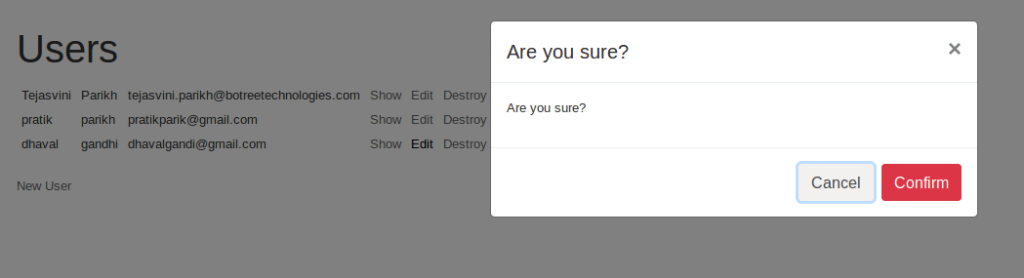
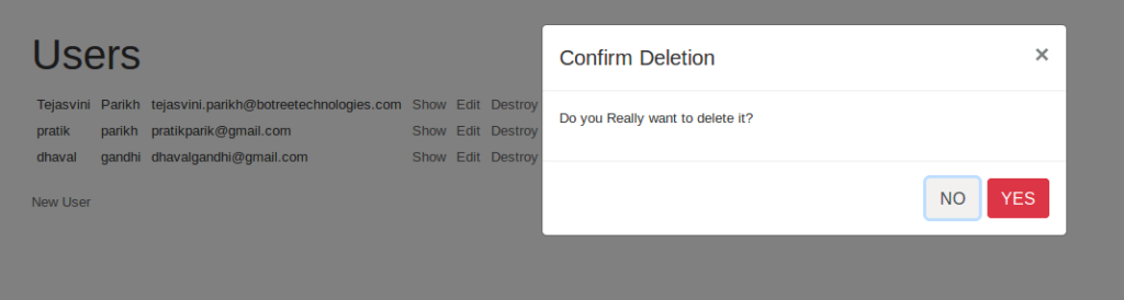
<%= link_to 'Destroy', user, method: :delete, id: 'delete_link',data: { confirm: 'Do you Really want to delete it?', title: 'Confirm Deletion' } %>
This link generates a confirmation box as shown in the below image.
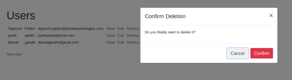
We can change the labels of commit and cancel button as well.
<%= link_to 'Destroy', user, method: :delete, id: 'delete_link',data: { confirm: 'Do you really want to delete it?', title: 'Confirm Deletion', commit: 'YES', cancel: 'NO' } %>
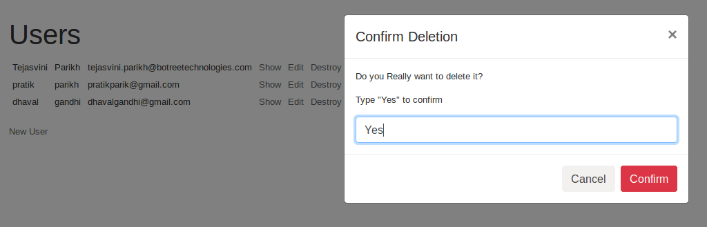
If we add verify: ‘Yes’, verify_text: ‘Type “Yes” to confirm’ data attributes then you can see confirmation box as displayed in below image. By default confirm button is disabled once you write valid text in given textarea then it will enable the confirm button.
*Note that it is case-sensitive.
We can set global values and can apply a custom CSS class to popup modals as well.
Let’s go through some more interesting examples for better understanding :
1. Add one javascript file named: confirm-modal.js and add the following code.
2. Require that js file in application.js by the following the line.
//= require confirm-modal
3. Add given code to your scss file.
4. Give link for confirm-modal.
<%= link_to 'Destroy', user, method: :delete, data: { confirm: 'Do you want to continue?' } %>
Above example will generate a confirmation box like given below:

We can restore default settings using dataConfirmModal.restoreDefaults() .
I hope you enjoyed this article. Keep following for more such articles.
You can access full codebase on this git repo:
https://github.com/TejasviniParikhbtc/CustomConfirmBox
Have a happy coding!
At BoTree Technologies, we build enterprise apps with our web development team of 30+ engineers.
We also specialize in RPA, AI, Python, Django, JavaScript and ReactJS.
Consulting is free – let us help you grow!


